![[2026] How to Dramatically Improve AI UI Generation with component.gallery! A Practical Guide to the Component Terminology Encyclopedia](/images/blog/component-gallery/00-top.png?v=25)
Summary
The truth is, the most effective way to get AI to create UIs (screens) is to correctly include component names (terminology)like "Accordion," "Modal," and "Card" in your instructions. And the free site that compiles the correct meanings and real-world examples of these terms isThe Component Gallery.
[2026] How to Dramatically Improve AI UI Generation with component.gallery! A Practical Guide to the Component Terminology Encyclopedia
"Frustrated that AI-generated UIs always come out looking generic and not sure what to type into the prompt?"
"Every time I ask AI (Claude Code or Cursor) to 'make a nice-looking screen,' it comes out kinda off... I can't seem to explain what I want clearly."
Sound familiar?
The truth is, the most effective way to get AI to create UIs (screens) is to correctly include component names (terminology)like "Accordion," "Modal," and "Card" in your instructions. And the free site that compiles the correct meanings and real-world examples of these terms isThe Component Gallery.
In this article, I'll walk you through the highlights of this site and explain — with practical examples even beginners can follow — how to use it for prompting AI.
By the end of this article, you'll understand:
- What component.gallery is
- Why using "component names" dramatically improves AI output
- Exactly what prompts to write
- How to incorporate this into your daily AI workflow
What Is component.gallery?
In a nutshell, it's a free encyclopedia site that collects real-world examples of UI parts from design systems around the world.
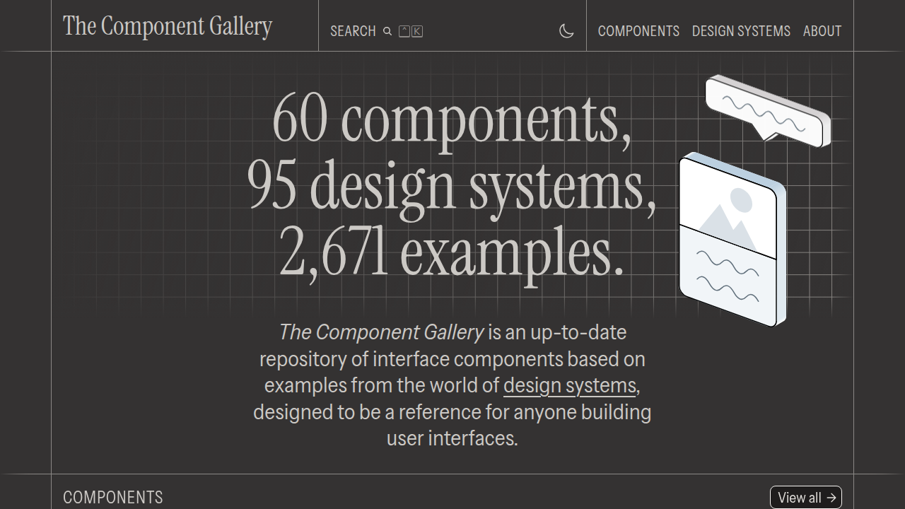
It brings together examples of "here's what this component looks like" from famous design systems — Apple's Human Interface Guidelines, Google's Material Design, GitHub's Primer, Atlassian, and more — all in one place.
What's Included
The site's "Components" page displays a full lineup of interface parts used on screen.
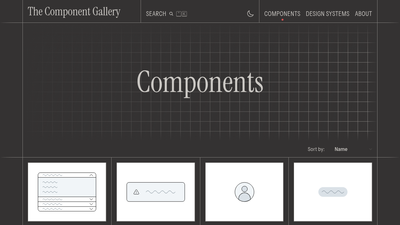
For example, you'll find components like:
- Accordion: A collapsible list that expands and collapses
- Alert: A warning or error message
- Avatar: A circular icon representing a user
- Badge: A small status indicator
- Breadcrumbs: A trail showing the current location
- Button: A clickable element
- Card: A container that groups information together
- Modal: A dialog that overlays the screen
- Drawer: A panel that slides out from the side
- Dropdown menu: A collapsible menu
Each component includes a definition of what the part actually isandvisual examples from each design system.
Exploring Real Component Examples
Let me highlight a few representative ones with real examples from the site.
Button
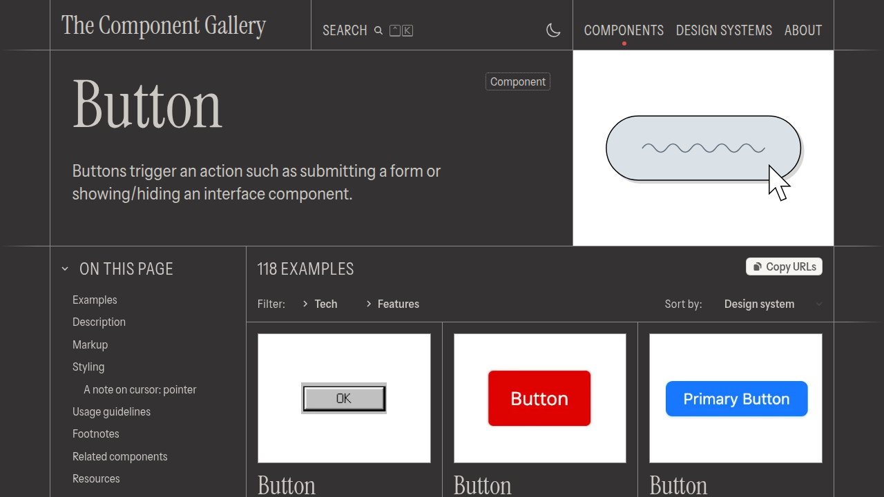
Even a simple "button" comes in a rich variety — primary vs. secondary, sizes, with or without icons, and more.
Card
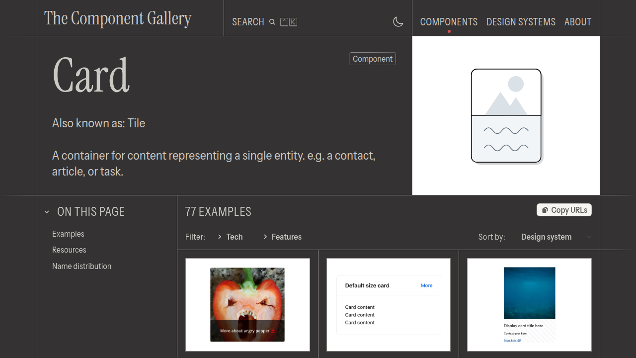
A "container" that groups information together. Used in social media posts, product listings, and more.
Modal
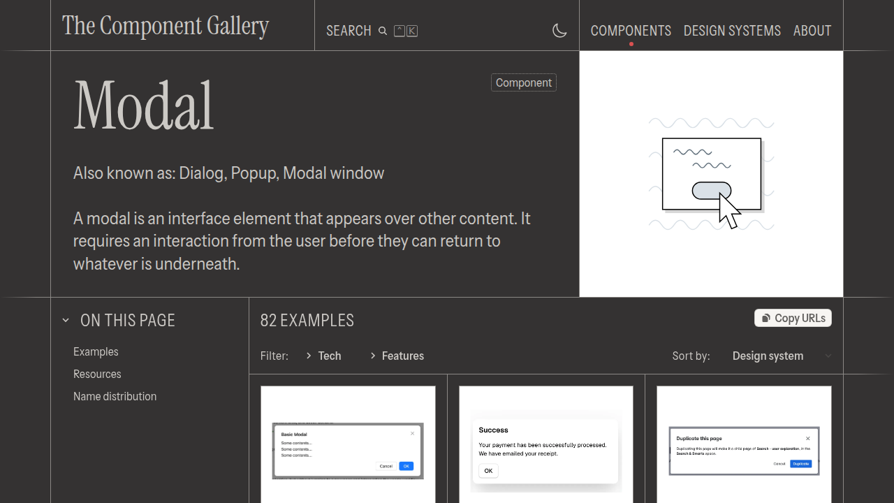
A detail view or confirmation dialog that overlays the screen. Commonly used in settings screens.
Accordion
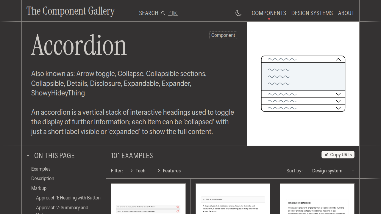
A collapsible list that opens and closes on tap. Familiar from FAQ pages and similar.
Why Telling AI "Component Names" Makes It Work Better
When asking AI to build UI, many people tend to phrase it like this:
"Make a nice-looking contact form"
With this, the AI interprets "nice-looking" however it wants. The result: jumbled layouts, hard-to-click buttons, etc.
On the other hand, if you check the terminology on component.gallery first and then ask like this:
"Create a Form with Text fields that have Labels, and a primary Button. Wrap the input fields in a Fieldset."
The AI can now precisely understand "which components to combine and how." Because the words (terminology) become a shared language.
AI Prompting: Bad vs. Good Examples
Here are three examples showing how things actually change.
Example 1: Settings Screen
| How You Instruct | Result | |
|---|---|---|
| ❌ Bad | "Make a settings screen" | Layout tends to be haphazard |
| ✅ Good | "Create a screen with a Drawer menu on the left and settings items separated by Cards on the right" | Structure becomes clear |
Example 2: Product Listing
| How You Instruct | Result | |
|---|---|---|
| ❌ Bad | "List the products" | Just a plain enumeration |
| ✅ Good | "Put each product in a Card, arranged in a 3-column Grid layout. Each Card should include an Image, Title, and Badge" | A visually appealing listing |
Example 3: Warning / Alert
| How You Instruct | Result | |
|---|---|---|
| ❌ Bad | "Show an error" | Just plain text |
| ✅ Good | "Show an Alert (danger variant) in a Modal on deletion, with two confirmation Buttons" | A user-friendly warning |
Prompting Techniques for AI Coding Agents
When using coding agents (Claude Code, Cursor, Codex, etc.) to build UI, you can leverage component.gallery with these steps:
Step 1: Verbalize the Screen You Want
"I want a contact page" → Break it into components: "I need a Form. Input fields should be Text fields. Submit should be a Button."
Step 2: Confirm Terminology on the Site
If you're unsure about the meaning, open the relevant component on component.gallery and check the definition and real examples.
Step 3: Put Component Names in Your Prompt
Create a contact form.
- Name, email, and message fields should be Text fields with Labels
- Submit should be a primary Button
- Wrap the whole thing in a Card, centered
- Use an Alert to flag missing required fields
Step 4: Review AI's Output and Fine-Tune
Add clarifications like "Make it feel more like a Modal" while referencing the real examples on the site.
Recommended Usage & Learning Path
Route A: Just Browse First (5 minutes)
- Skim the top page to get the overall picture
- Browse the Components list to get familiar with the names
- Click into 1–2 components that catch your eye
Route B: Integrate Into Your AI Workflow (Practical)
- When you want AI to build UI, first verbalize the components
- Look up any unfamiliar terms on component.gallery
- Send your prompt with component names to the AI
Route C: Master the Terminology (Advanced)
- Memorize the 20 most common components (Button, Card, Modal, Accordion, etc.)
- Eventually you'll be able to give precise instructions without having to check the site
Questions Readers Ask
Q1. Is component.gallery free?
Yes, it's a free public site. No account registration required — anyone can browse it.
Q2. Is it useful even for non-designers?
Absolutely. In fact, it prevents failures caused by "not speaking the same language," so non-designers benefit the most.
Q3. Does it include implementation code for specific frameworks (React, etc.)?
The site's primary focus is "component meaning and real examples." It's meant to be used as a "shared design language," not as a source of implementation code.
Q4. What else can I use it for besides AI prompting?
Design reviews and creating shared understanding within teams — "Should we use a Modal? Or a Drawer?" — such conversations flow much more smoothly.
Q5. Does it include mobile screen components?
Yes. Components used on mobile (Bottom navigation, Drawer, etc.) are also included.
Q6. How long will this site's information stay accurate?
The site is designed to update alongside each design system's latest version, but for fine details, cross-referencing official documentation (Apple HIG, Material, etc.) is the safest approach.
Summary
The Component Gallery is a free "component terminology encyclopedia" that collects real-world examples of UI parts from design systems around the world.
When you ask AI (Claude Code, Cursor, etc.) to create UI, simply including the correct component names — like "Accordion," "Modal," "Card" — in your instructions dramatically improves output quality.
- First, get familiar with the terminology on the site
- Break down the screen you want into components
- Send your prompt to AI with component names included
Just by running this cycle, your AI-assisted UI creation — which previously felt "not quite right" — will improve dramatically.
This article is for informational purposes only. The content on component.gallery is based on publicly available information from the official site. Please check the official site for the latest component listings.Related Reading
- [2026] Claude Fable 5 Financial Asset Protection Guide: AI Agent for Asset Management, Monitoring & Optimization
- [2026] Cloudflare Monetization Gateway Complete Guide: How to Add One-Time Billing to Web Pages, APIs, and MCP Tools
- [2026] A Fable of Codexes Complete Guide: How to Build an AI Worker Army Commanded by Claude
- [2026] GPT-Live Complete Guide: How OpenAI's Full-Duplex Voice AI Fundamentally Changes ChatGPT
- [2026] ChatGPT vs Claude vs Gemini 2026: Ultimate Comparison from Free to Paid Plans
Related reading
Share this article
Related articles

Jul 4, 2026
Unreal Engine MCP Complete Guide 2026: Using UE5.8 AI Integration with Hermes Agent & Claude Code for Beginners
Jun 22, 2026
Hermes Agent vs Cursor — Full Comparison 2026: Which Should You Choose? Complete Guide to Using Both

Jun 22, 2026
Hermes Agent Complete Guide 2026: The Most Powerful Open-Source AI Agent by Nous Research

Sep 2, 2026
10 Best Websites to Get DESIGN.md in 2026: Design Specification Files for AI Agents

Jul 5, 2026
Fable Loop Library Complete Guide 2026: Fully Automating Claude Fable 5 with 25 Workflows, Explained for Beginners
Jul 17, 2026
【2026】OmniRoute Complete Guide: Dramatically Cut Claude Code API Costs with a Free AI Gateway